WEB3.0


Joepegs is an Avalance-based NFT marketplace from the Trader Joe's team – a severe player in the DeFi field
Trader Joe's has one of the best DEXes on Avalanche, with a market capitalization of more than $57 millions
Joepegs
04
scope
01 Research
Competitive analysis / Hypothesis validation / UX
02 creative
Branding / Concept / ui / Landing page
03 adaptive
Marketing Assets /adaptive and responsive layouts
04 support
UI kit / Design system / support product
Client
about
Trader Joe's is a big fish in the crypto industry, especially on Avalanche, considering this network's expansion
our work
Currently, Trader Joe's is building on the entire ecosystem of the products, such as the NFT marketplace and NFT accelerator, promo landings for curated NFT collections
we also created a set of marketing assets to customize the client's Discord server and differentiate the roles there.Here we had to vary brand heroes made as different personages

Process
main goal
“Our main goal was to build a marketplace from scratch to be seamless and create a competitive advantage”
challenge
Many vendors aim to copy Opensea, so the market is full of similar products and approaches. Teams should set up a few research and user testing rounds to create something new
We bring a social impact to the product as we get users' needs. The next step is to convince the stakeholders and target audience, showing that the idea works and hypotheses are approved

explore
explore
On the explore page, we added a range of filters that help users specify their needs and find NFTs quicker
Also We adopt a fullscreen search with featured items and highlighting chosen objects on the right side


market
market
We consider the results of the Discovery research (what users need) and trends of the biggest players in the industry (what the market needs)
The collection page contains all the needed information to know the collection better. We always include mobile adaptive in our scope to be on the same page with busy bees


nft page
nft page
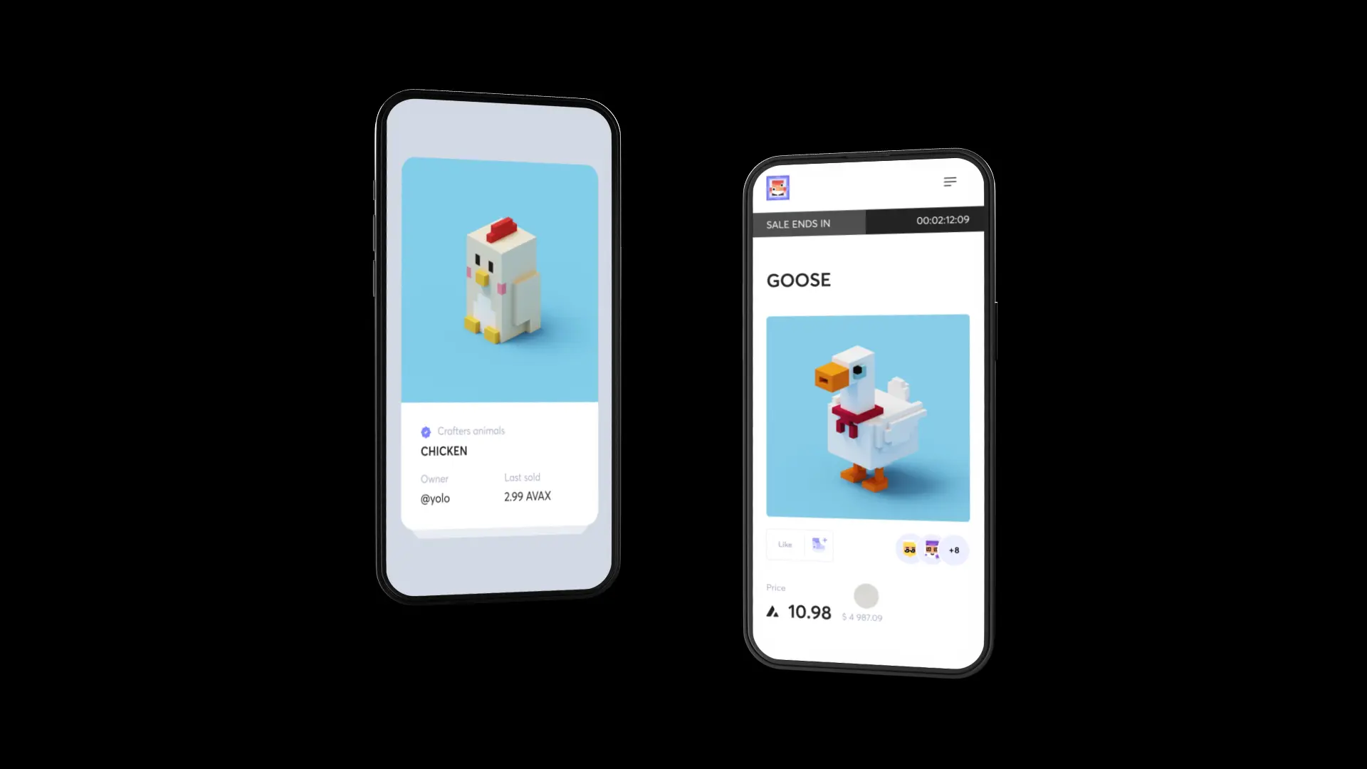
We refreshed the NFT page and added a social component. So users can influence the collection reputation and rate the NFTs
The next absorbing feature here is a reaction to NFTs - you can pick up a custom-made emoji connected to the brand hero


offering
offering
Besides, we added features inherent in standard marketplaces. So the buying and offering experience can be made in a few clicks
We use logically structured layouts to provide a user-friendly UI for newcomers in the crypto sphere


minting
the main feature
“The main feature of this marketplace is the minting experience. It is a consistent process comprised of massive promo campaigns”
process
The buying experience is easy: connect your wallet and participate in a Dutch auction. Such an approach helps creators increase their fan community
It implies industry development as we assist creators in building their brands and improving recognition. Such a system approach makes products more comprehensive for users

process
We created an evident navigation system across all minting collections, so users can easily see future drops and grab some NFTs
Users can see all recent minting activities in real-time (we applied the same mechanics as in streams), provoking them to hurry up to buy NFTs


profile
profile
We've rethought the profile navigation to improve accessibility, so you can track portfolio details on one page
DETAILS
We pay extra attention to the details to make all layouts well-balanced with information and visuals
wallet and swap, weRE placed together in a header to always be accessible for immediate action


details
DETAILS
The comprehensive Design System that we created allows easy app extension as components simplify new features design
Besides, the existing component elements can be quickly adjusted or replaced


dark theme

color schemes
We analyzed the color gamut in the crypto field and chose distinctive colors to look more prominent over competitors
We care about a platform to be equally good in light and dark schemes. The user-first approach helps us build more sustainable products


